City of Toronto eFun

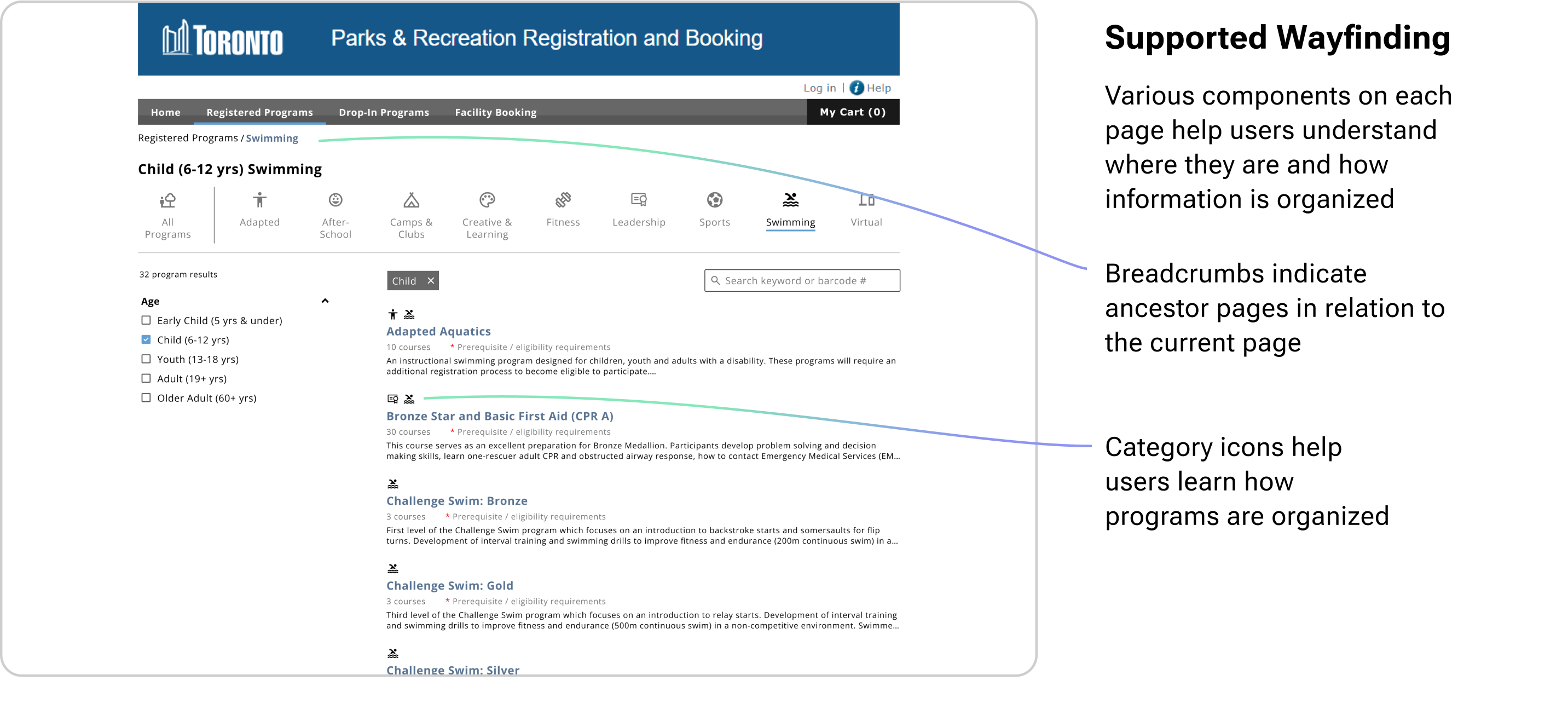
Reimagining the way programs are found to encourage participation in recreation

UX/UI Designer
Solo
Feb - Jul 2024
Figma
User research, visual design, information architecture, prototyping

Background

This project is focused on eFun, the City of Toronto’s online platform used to register for recreational programs, reserve a spot in drop-in programs, and book space at facilities.

I started this self-led project because when I discovered eFun, my immediate impression was that it looked like it belonged on an old boxy desktop computer. Beyond the dated visuals, the experience was confusing and overwhelming.

Since this project was completed, the City of Toronto updated their registration system to a new platform (as of November 6, 2024).

Problem

The City aims to make recreation accessible for its rapidly growing population, especially for underserved communities and residents. However, eFun has seen little to no upgrades since being introduced in 1999. For many years, residents have expressed their frustrations with using the site and their desire for upgrades.
So, my goal was...
To enable easy and straightforward registration for recreation programs that helps people in Toronto feel empowered to participate in recreation.

Solution Preview

The proposed design updates make it easy for users to discover and find programs because if users can't find the program they want, they can't register.
Video preview of proposed eFun design

Getting an Understanding of the Problem Space

1/ Background Research
To get a better understanding of eFun's current landscape, I reviewed 3 reports prepared by the City of Toronto. The key takeaways were...
👤 Priority Demographic
  • Programs for children, youth, and older adults are less available in the larger recreation sector.
  • These groups are also more likely to be limited by income and/or have barriers to transportation.
✅ Registration Day
  • More than 50% of registrations occur within the first hour of availability.
  • In 2011, online registration was the most popular method of enrollment (and has likely grown significantly in popularity since).
📊 Most Popular Programs
  • Registrations for children and youth (ages 0-24) make up nearly 80% of total registrations.
  • Swimming, camps, and sports are the most popular program categories.
📢 City-Led Initiatives
  • Initiatives have been implemented to manage increasing waitlists by helping fill available spaces and create additional participation opportunities.

Sources: City of Toronto: Recreation Service Plan 2013-2017; Community Recreation 2018-2020 Growth Plan and Waitlist Management Report for Action; Sports and Recreation Services 2017 Performance Measurement & Benchmarking Report

2/ Testing Baseline Usability
Building on the background research, I conducted 10 moderated usability tests to evaluate the current eFun user experience. Participants were tasked with finding a suitable swimming program for a 10 year old child.

The two main themes discovered were: 1) participants couldn’t find or 2) didn’t know what they were looking for. Let's take a look at the current eFun design...

Competitor Review

I reviewed 3 direct competitors to see how each platform functioned and supported users with finding recreation programs. Evaluating the strengths and weaknesses of these platforms helped to inform and inspire the design process.

Guiding Principles

Informed by the background research and competitor review, I established two "principles" to help guide the design process to achieve the desired outcome.
🌱 Relevance & Brevity
Present information in a way that is digestible and meaningful to users.
🤝🏼 Supportive
Help users convert interest into completing registration, and help them feel supported in the search process.

Design Ideation

Based on the opportunity tree generated in the Understand phase, I brainstormed solutions for each opportunity then assessed them based on impact and feasibility to determine which to prioritize.

I decided to move forward with the Easy Wins:
  • More interaction feedback for filters and searching
  • Declutter and re-organize landing and results pages
  • Make the existing filters more intuitive and familiar

Prioritization Matrix

While being both highly impactful and highly feasible, these solutions focus on improving what is already existing and creating a stronger foundation. Without a strong foundational experience, it might not be as valuable to start introducing new feature like sorting results by proximity or a customer service live chat.

Design Testing & Iterating

First, I started by exploring ways to improve the Program Registration filters through modifications to the information structure, labels, interactions, and UI. To test the design, I created a high fidelity prototype which was made easy by reusing components of the existing design.
Testing the Filters Design
Objective
Understand how users interact with the redesigned filters and sub-pages; and whether these new elements allow users to find recreational programs easier.
Methodology
  • 6 moderated usability tests
  • Participants were tasked with finding a basketball program for adults using both the existing eFun platform and my prototype
  • The order of which eFun version was tested first was alternated to mitigate primacy and recency bias
🔎 Outcomes
  • Improve differentiation between applying filters and navigating to new pages
  • Revise the program categories for better clarity and appeal
  • The visual hierarchy of the results needs improvement as it greatly impacts users’ overall experience
💭 Insights
  • Participants that were already familiar with the existing platform were less likely to make an error and completed tasks faster
  • The new filters panel reduced errors by 17%, which is expected to have a larger impact as the task complexity increases
Prototype
After a few rounds
of iteration...
Design Revision

The Final Design

To register in a program, users first need to find the programs that suit their needs. The proposed design improves the program finding experience by making it easier to initiate the process, navigate, and digest the information.

Edge Scenarios

Usability testing also identified that a friction point was messaging that left users feeling confused and unsure how to move forward. So, the proposed design enhances the messaging clarity to lead users back to the happy path.

Next Steps

⏭️ Integrate Design Globally
eFun also serves as a platform for drop-in program reservations and facility bookings. To establish a cohesive experience, the proposed design should be integrated across these sections.
🗂️ Explore Admin Experience
Given the large number and variety of programs that are offered in Toronto, it is important that the administrative process is as simple and efficient as possible. Thus, alignment between the user and administrative interfaces is imperative.
👀 Explore "See Also" Feature
The City of Toronto launched an initiative in 2017 that emailed customers about alternative program locations and saw a 14.4% increase enrollment. A similar feature built into eFun could help people discover new programs they are interested in.

Reflections

  1. Take the time to understand your content
    Understanding all the nuances of the programs was more complicated than expected, but was important to do to get a holistic view. At the end of the project, I discovered auditing crawler tools (like Screaming Frog) that would have been useful, but is now in my toolbox for future projects.
  2. Test early and often
    Getting usability feedback early in the project really helped to identify what pained people the most. Then, testing the prototype helped to evaluate whether my design solution was on the right track.